

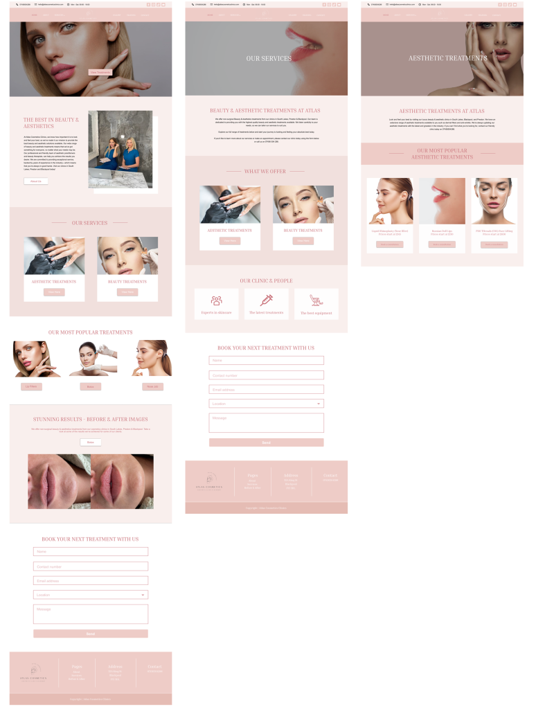

Atlas Cosmetics Clinics
Medical aesthetics and beauty
Entire product design from research to conception and visualisation.
Figma – Photoshop – Illustrator – Miro – Figjam – Google suite – Cpanel
11 months
Atlas Cosmetics Clinics is a medical aesthetics clinic, beauty spa and aesthetics training centre based across 3 locations in the North of England.
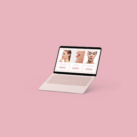
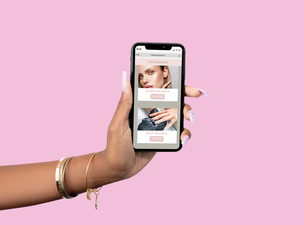
My challenge was to create a new website for the clinic that would replace their old website. This also included a rebrand as the clinic had recently expanded into a new area which had a different demographic. The clinic also wanted to have a training website where users would purchase their courses and complete them in a client portal.
I started this project by having a meeting with the directors of the clinic. We went through their business goals, strengths and weaknesses of their existing website, and a deep dive into their users, who they are and what defines them.
We had a second meeting which involved their videographer and copywriter too. This helped us define assets we’d be able to use to create a product that would tick all their business needs boxes, and create a positive experience for the user.
The initial phase of the research process started with meetings between the stakeholders and myself. This is always a good starting point to get under the skin of the business and understand their commercial goals as well as gain valuable insights from them about their industry, competitors and users.
The research was divided between three geographical areas (2 were similar) and the third location was very different. City vs Country location for example.
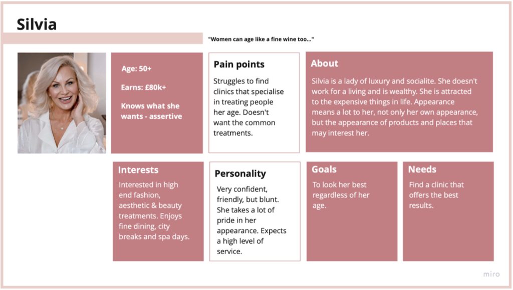
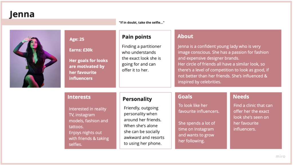
There were two main demographics defined through the research.
reviewing the social media activity for each clinic. This helped me establish a demographic that was typical with each clinic.
We had strong data to review from their existing client base and years of experience operating in their industry in a fixed location. This helped to provide ideas of what would work for their existing users. However, their new target demographic needed further research.
I conducted a competitor analysis in their new location. I wanted to establish any trends, the language they used, the images they used to represent their users and the overall visual look and feel of the design.
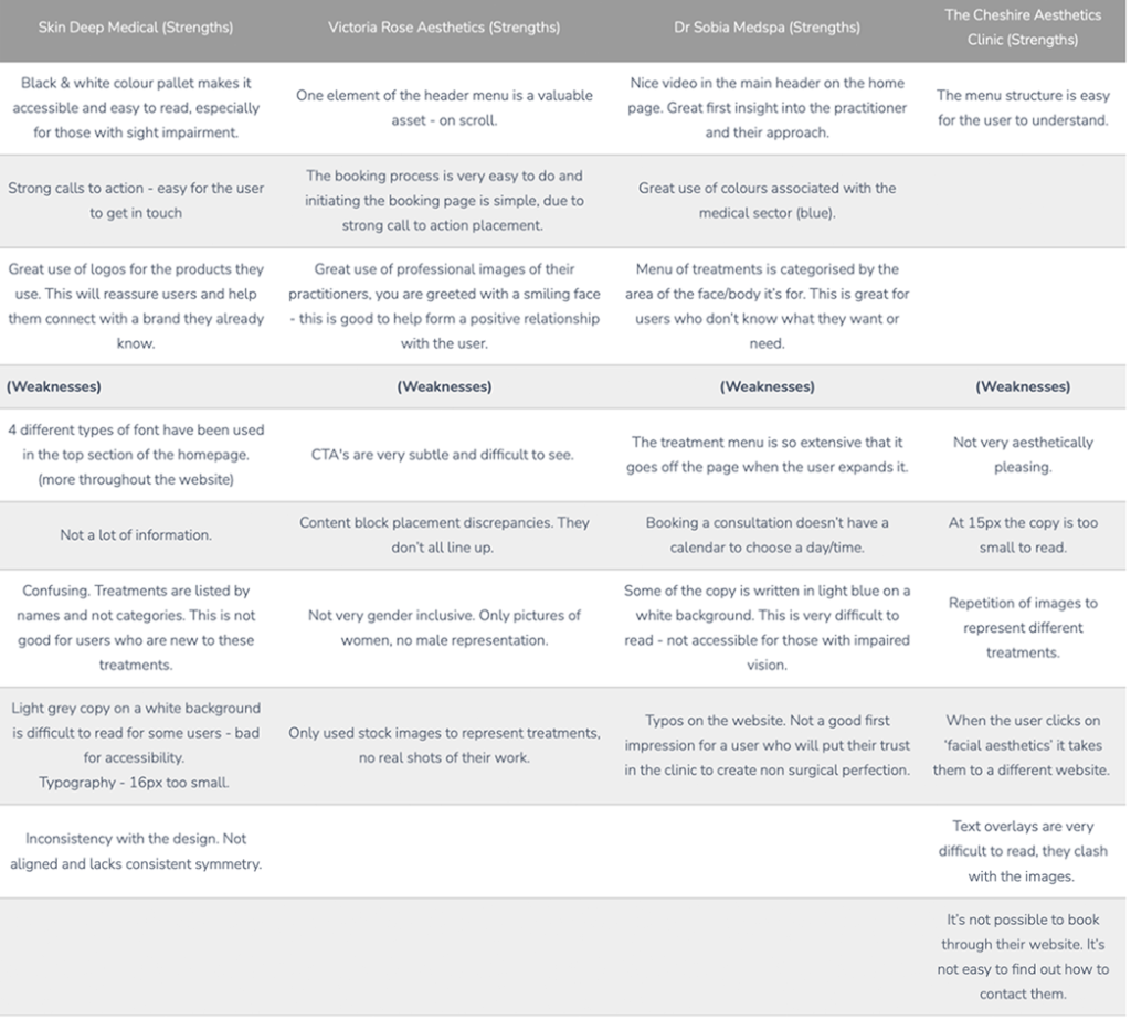
Skin Deep Medical (Strengths) | Victoria Rose Aesthetics (Strengths) | Dr Sobia Medspa (Strengths) | The Cheshire Aesthetics Clinic (Strengths) |
Black & white colour pallet makes it accessible and easy to read, especially for those with sight impairment. | One element of the header menu is a valuable asset - on scroll. | Nice video in the main header on the home page. Great first insight into the practitioner and their approach. | The menu structure is easy for the user to understand. |
Strong calls to action - easy for the user to get in touch | The booking process is very easy to do and initiating the booking page is simple, due to strong call to action placement. | Great use of colours associated with the medical sector (blue). | |
Great use of logos for the products they use. This will reassure users and help them connect with a brand they already know. | Great use of professional images of their practitioners, you are greeted with a smiling face - this is good to help form a positive relationship with the user. | Menu of treatments is categorised by the area of the face/body it’s for. This is great for users who don’t know what they want or need. | |
(Weaknesses) | (Weaknesses) | (Weaknesses) | (Weaknesses) |
4 different types of font have been used in the top section of the homepage. (more throughout the website) | CTA's are very subtle and difficult to see. | The treatment menu is so extensive that it goes off the page when the user expands it. | Not very aesthetically pleasing. |
Not a lot of information. | Content block placement discrepancies. They don’t all line up. | Booking a consultation doesn’t have a calendar to choose a day/time. | At 15px the copy is too small to read. |
Confusing. Treatments are listed by names and not categories. This is not good for users who are new to these treatments. | Not very gender inclusive. Only pictures of women, no male representation. | Some of the copy is written in light blue on a white background. This is very difficult to read - not accessible for those with impaired vision. | Repetition of images to represent different treatments. |
Light grey copy on a white background is difficult to read for some users - bad for accessibility. Typography - 16px too small. | Only used stock images to represent treatments, no real shots of their work. | Typos on the website. Not a good first impression for a user who will put their trust in the clinic to create non surgical perfection. | When the user clicks on ‘facial aesthetics’ it takes them to a different website. |
Inconsistency with the design. Not aligned and lacks consistent symmetry. | Text overlays are very difficult to read, they clash with the images. | ||
It’s not possible to book through their website. It’s not easy to find out how to contact them. |
Upon researching direct and indirect competitors of Atlas’ I was able to establish common themes that made the customer journey through the website easy, vs difficult. Each website had their negative points – visually. But the user journey was intuitive and simple to contact the clinics if more help was needed.
I found that in the new location, other clinics used images of older people to represent their treatments. Inner city clinics tended to use young attractive models. I didn’t see any male representation on any of the websites.
The best websites categorised their treatments by the area of the face/body that would be treated. Those same websites also had very easy to navigate booking systems. The average was two scroll strokes to find the booking cta.
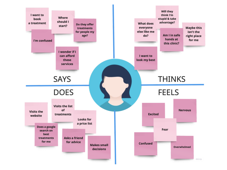
The stakeholders asked a range of willing participants what they thought about when visiting clinic websites and how they feel when visiting a new website for the first time.
Users want to see before & after images
Users want to be represented by models that look more like them
Users want treatments categorised by the area, rather than the name
Patient safety and a friendly atmosphere are essential
Users want the ability to book online
The personas were created from research and knowledge that the clinic already had from serving patients in their business for a number of years prior to this project. The client also wanted to target a new location that they were about to operate in. We established a persona that represented their demographic, whilst including the existing demographic.
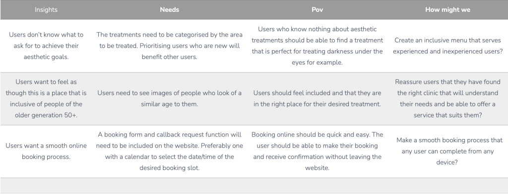
Insights | Needs | Pov | How might we |
Users don’t know what to ask for to achieve their aesthetic goals. | The treatments need to be categorised by the area to be treated. Prioritising users who are new will benefit other users. | Users who know nothing about aesthetic treatments should be able to find a treatment that is perfect for treating darkness under the eyes for example. | Create an inclusive menu that serves experienced and inexperienced users? |
Users want to feel as though this is a place that is inclusive of people of the older generation 50+. | Users need to see images of people who look of a similar age to them. | Users should feel included and that they are in the right place for their desired treatment. | Reassure users that they have found the right clinic that will understand their needs and be able to offer a service that suits them? |
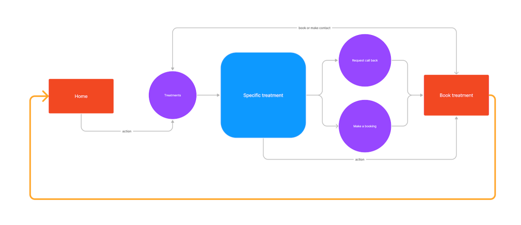
Users want a smooth online booking process. | A booking form and callback request function will need to be included on the website. Preferably one with a calendar to select the date/time of the desired booking slot. | Booking online should be quick and easy. The user should be able to make their booking and receive confirmation without leaving the website. | Make a smooth booking process that any user can complete from any device? |
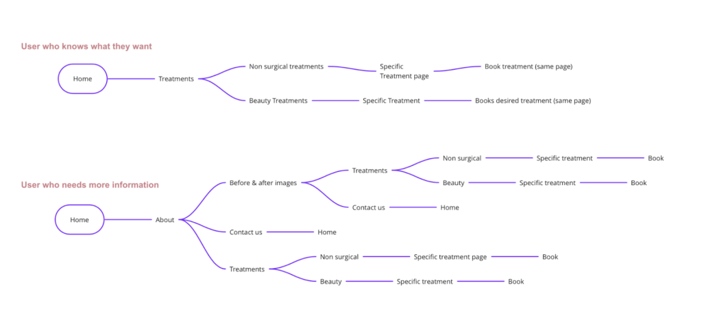
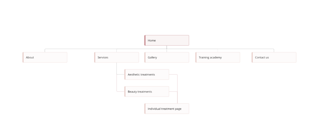
The design was started with the creation of a site map.
This was constructed by utilising competitor research, empathy and customer journey mapping and ‘how might we’ research.
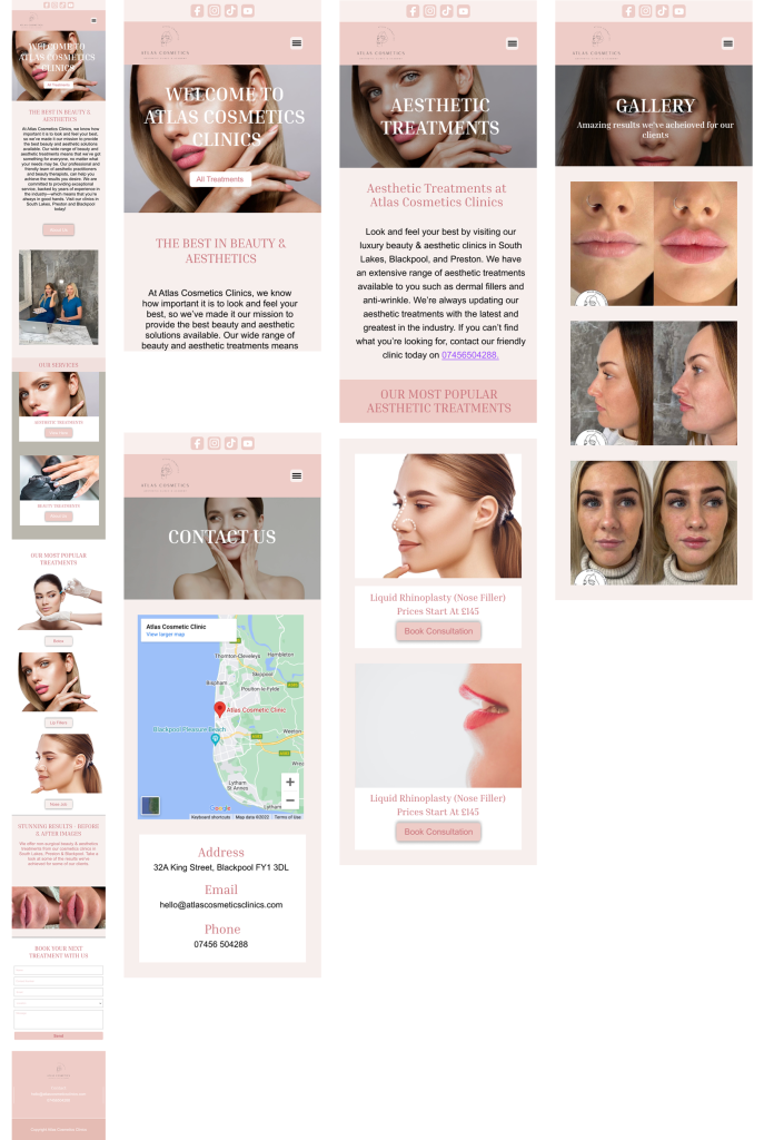
The design needed to be clean, professional and representative of the medical aesthetics industry. The new product also needed to represent all users, from their youngest user to their oldest. We discussed having a section for men, but this was something the client wanted to redress at a later date.
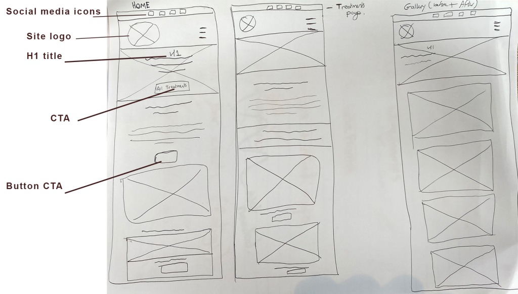
The initial tests were performed by two directors, two lead practitioners and their copywriter. The team were provided with a prototype that was created in figma. This was done in a meeting where they each accessed the prototype on one laptop that they passed round.
The clinic wanted to conduct their own user tests. I gave them instructions on how to do this and advised them to keep their sample size to a maximum of 7 users. I provided the stakeholders with questionnaires and tasks they should ask their users to complete.