creating an online booking solution & making services accessible


Client
Earby Dental Clinic
Sector
Dental & cosmetic dentistry
My role
Lead UX/UI designer (researcher/visual designer) website designer
Tools
Figma – Photoshop – Illustrator – Miro – Google suite – Figjam
Project duration
10 months
Overview
Earby Dental is Yorkshire-based dental practice that offers its services to both private and NHS patients, whilst also offering cosmetic dentistry.
My challenge was to create a new website for the practice that would offer their users an engaging experience whilst facilitating growth and future development of the business and brand. The website also needed to represent two different users – private and NHS.
I set out to design a solution that would fulfil several users’ needs. Some users would be private, some would be NHS, some would need emergency treatment and others would require cosmetic treatments. Something that would be more of a luxury as opposed to necessity.
Research
The client presented me with a list of dental practice websites they liked the look of.
During this meeting, we went through a swot analysis of the dental practice and went through some of their main competitors. I added to this with my own research, but businesses who’ve been operating from a location for 10+ years tend to have a good idea who their competitors are. I utilised this insight as it was a valuable asset in my research.
In addition to researching their competitors, I researched industry leaders to see what differentiated them from their competitors. This gave me an insight into the architecture of large practices websites. I also identified common themes, such as listing their accreditations, results, prices and more.
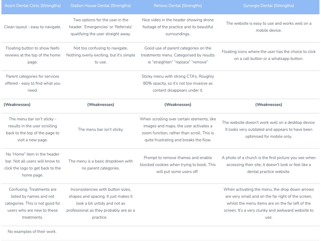
Acorn Dental Clinic (Strengths) | Station House Dental (Strengths) | Renovo Dental (Strengths) | Synergie Dental (Strengths) |
Clean layout - easy to navigate. | Two options for the user in the header. ‘Emergencies’ or ‘Referrals’ qualifying the user straight away. | Nice video in the header showing drone footage of the practice and its beautiful surroundings. | The website is easy to use and works well on a mobile device. |
Floating button to show feefo reviews at the top of the home page. | Not too confusing to navigate. Nothing overly exciting, but it’s simple to use. | Good use of parent categories on the treatments menu. Categorised by results ie “straighten” “replace” “remove” | Floating icons where the user has the choice to click on a call button or a whatsapp button. |
Parent categories for services offered - easy to find what you need. | Sticky menu with strong CTA’s. Roughly 80% opacity, so it’s not too invasive as content disappears under it. | ||
(Weaknesses) | (Weaknesses) | (Weaknesses) | (Weaknesses) |
The menu bar isn’t sticky - results in the user scrolling back to the top of the page to visit a new page. | The menu bar isn’t sticky. | When scrolling over certain elements, like images and maps, the user activates a zoom function, rather than scroll. This is quite frustrating and breaks the flow. | The website doesn’t work well on a desktop device. It looks very outdated and appears to have been optimised for mobile only. |
No ‘Home” item in the header bar. Not all users will know to click the logo to get back to the home page. | The menu is a basic dropdown with no parent categories. | Prompt to remove iframes and enable blocked cookies when trying to book. This will put some users off. | A photo of a church is the first picture you see when accessing their site, it doesn’t look or feel like a dental practice website. |
Confusing. Treatments are listed by names and not categories. This is not good for users who are new to these treatments. | Inconsistencies with button sizes, shapes and spacing. It just makes it look a bit untidy and not as professional as they probably are as a practice. | When activating the menu, the drop down arrows are very small and on the far right of the screen, whilst the menu items are on the far left of the screen. It’s a very clunky and awkward website to use. | |
No examples of their work. |
Findings
The best websites used their own images and had a very clinical theme throughout their websites.
This would reassure the user that they are in the right place. With some of the websites, if the logo was removed, you’d never know you were on a dentists website.
All the websites that were researched offered online booking, out of hours emergency contact details and the option to pay for treatments by using finance.
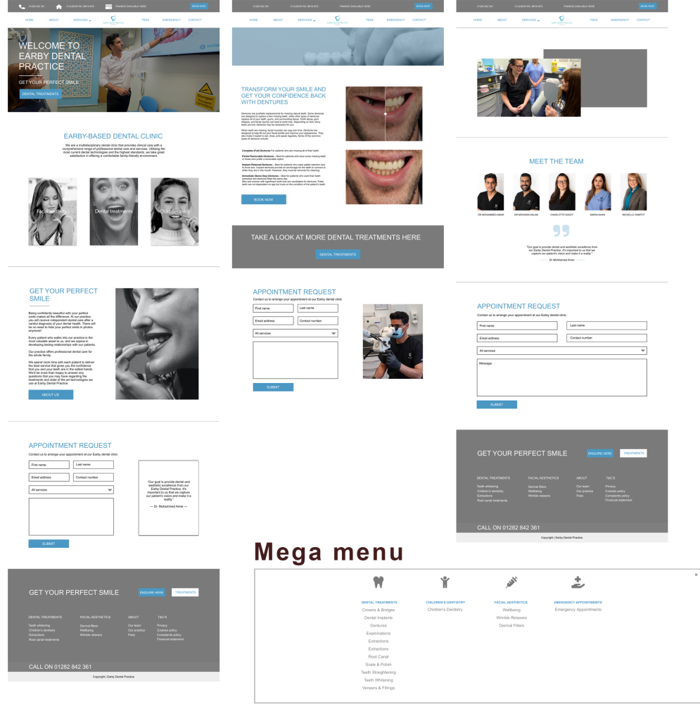
The competitor analysis highlighted that most of the practices have extensive treatment menus. The best and easiest websites to navigate utilise mega menus and parent categories to make their menus clear and easy for the user to navigate. One practice was quite creative with their parent categories too. Making it clear and easy to understand.
Some of the websites lacked images of their work.
Interviews and empathy mapping
The stakeholders asked a range of willing participants what they thought about when visiting dental practice’ websites and how they feel when visiting a new website for the first time. An email campaign out with a simple survey to gain this insight.

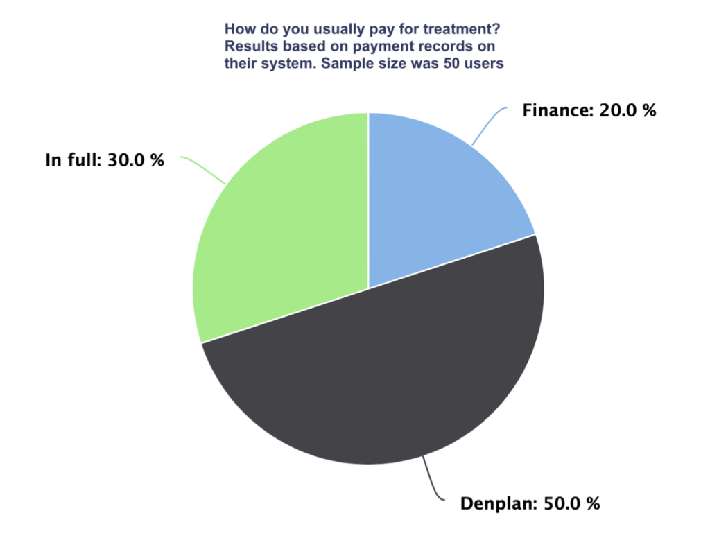
- Users want to see before & after images
- Users want a private section and an NHS section
- Users want to see prices for treatments
- Users want options to contact in case of an emergency
- Users want the option to apply for finance due to high value treatments
Persona Development
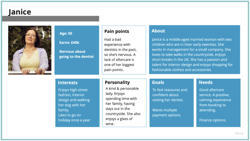
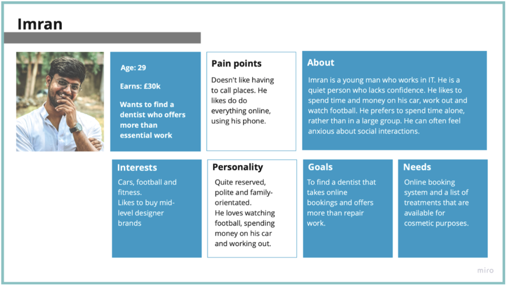
The personas were created from research and knowledge that the practice already had from serving patients in their business for a number of years prior to this project. The client had also created personas that he shared with me. I used these and added to them based on my findings.
How might we...
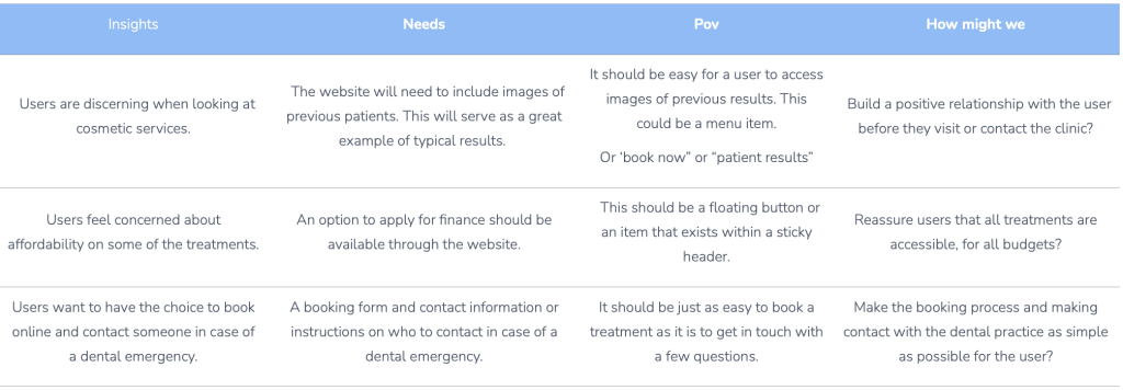
Insights | Needs | Pov | How might we |
Users are discerning when looking at cosmetic services. | The website will need to include images of previous patients. This will serve as a great example of typical results. | It should be easy for a user to access images of previous results. This could be a menu item. Or ‘book now” or “patient results” | Build a positive relationship with the user before they visit or contact the clinic? |
Users feel concerned about affordability on some of the treatments. | An option to apply for finance should be available through the website. | This should be a floating button or an item that exists within a sticky header. | Reassure users that all treatments are accessible, for all budgets? |
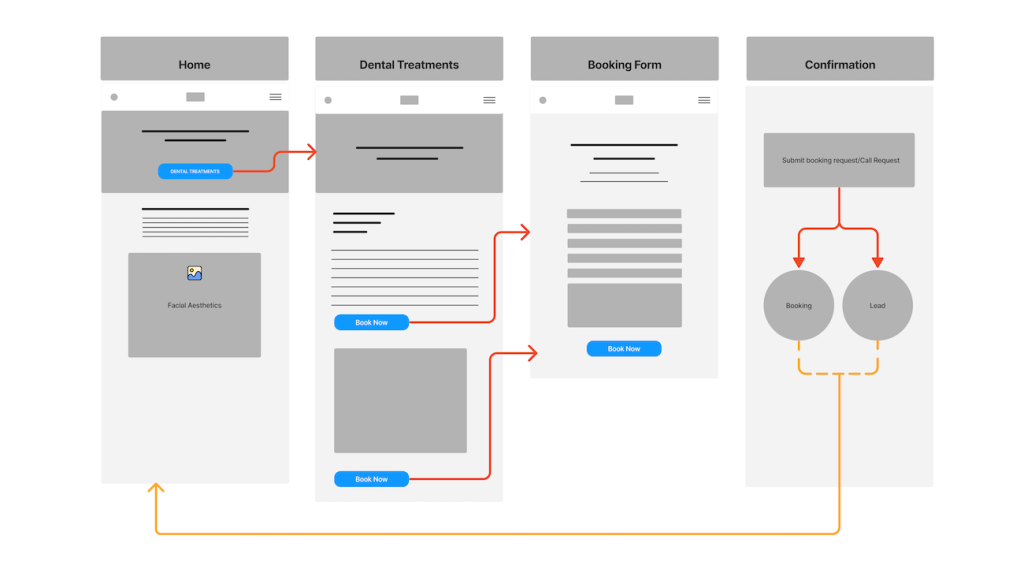
Users want to have the choice to book online and contact someone in case of a dental emergency. | A booking form and contact information or instructions on who to contact in case of a dental emergency. | It should be just as easy to book a treatment as it is to get in touch with a few questions. | Make the booking process and making contact with the dental practice as simple as possible for the user? |
User journey

Site map
Design
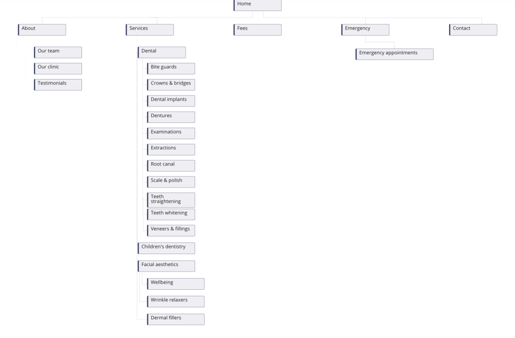
The design was started with the creation of a site map.
This was constructed by utilising competitor research, empathy and customer journey mapping and ‘how might we’ research.
The website needs to be easy to navigate and engaging for the user. If the site is simple and intuitive to navigate, it will contribute to a positive and engaging user experience. The product also needs to build trust with the user at every action.
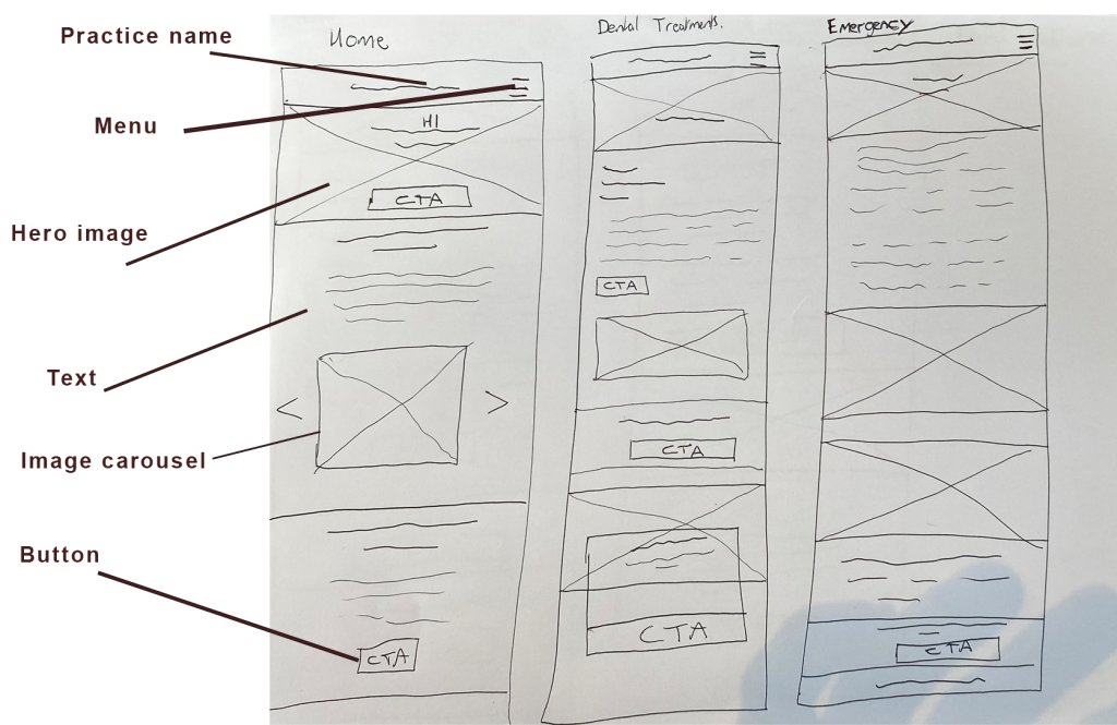
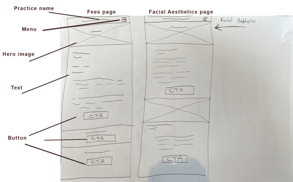
Lo fi wireframes
UI flow
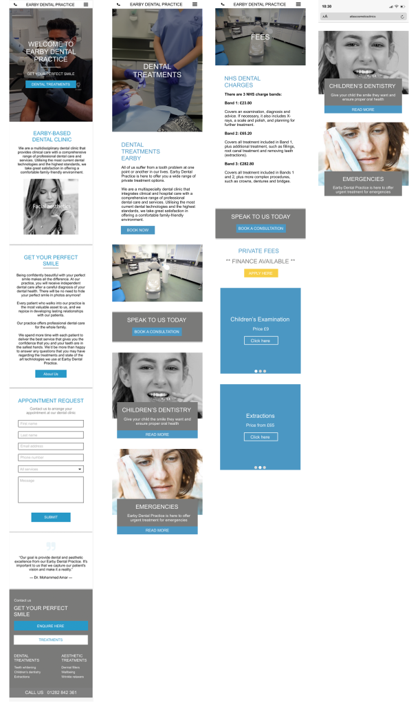
Hi fi wireframes
Mobile
Desktop
Testing
The stakeholders were given access to a prototype that was created in figma.
This prototype was shared and accessed by the entire team at Earby Dental. For some, this was the first time they had seen any designs relating to their new website.
The client decided to share the prototype with 3 of their patients. This was done without my instruction, however the findings were valuable, so I was happy to progress along with the product.
I created an affinity map, containing feedback from the users. This provided a great strategy to not only design around the users needs (which I now knew) but also made it easier to justify design decisions to the client.
Mockups of the final product
