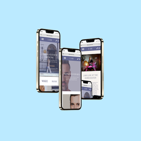
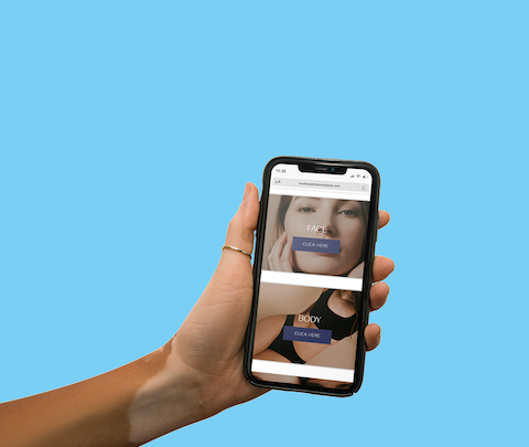
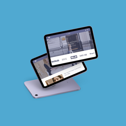


London Aesthetic Medicine
Medical aesthetics
Entire product design from research to conception and visualisation.
Figma – Photoshop – Illustrator – Miro – Google suite – Cpanel – Figjam
18 months
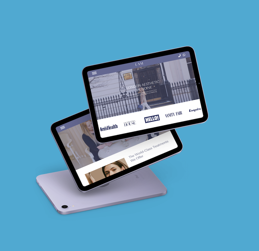
London Aesthetic Medicine (LAM) is a high end, luxury clinic based on the prestigious Harley Street in London.
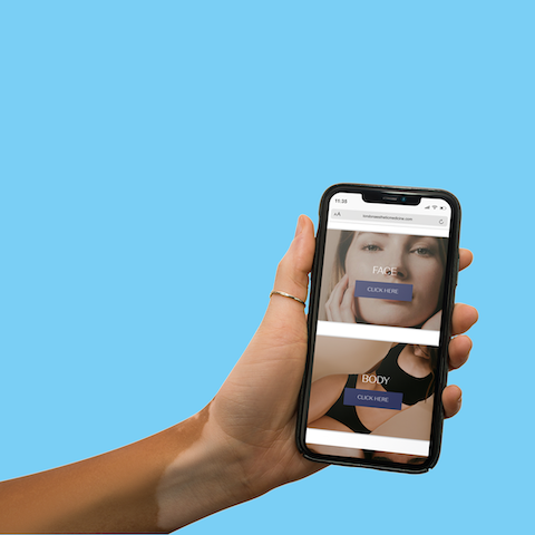
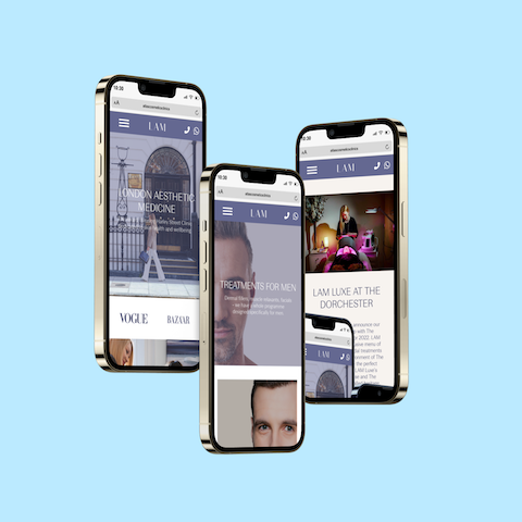
My challenge was to create a new website for the clinic that would offer their users an engaging experience whilst facilitating growth and future development of the business and brand.
Using the design thinking method I set out to design a solution that would fulfil two core needs. The needs of the user and the needs of the business. In very simple terms, the goal was to create a product that would engage the user and grow the business.
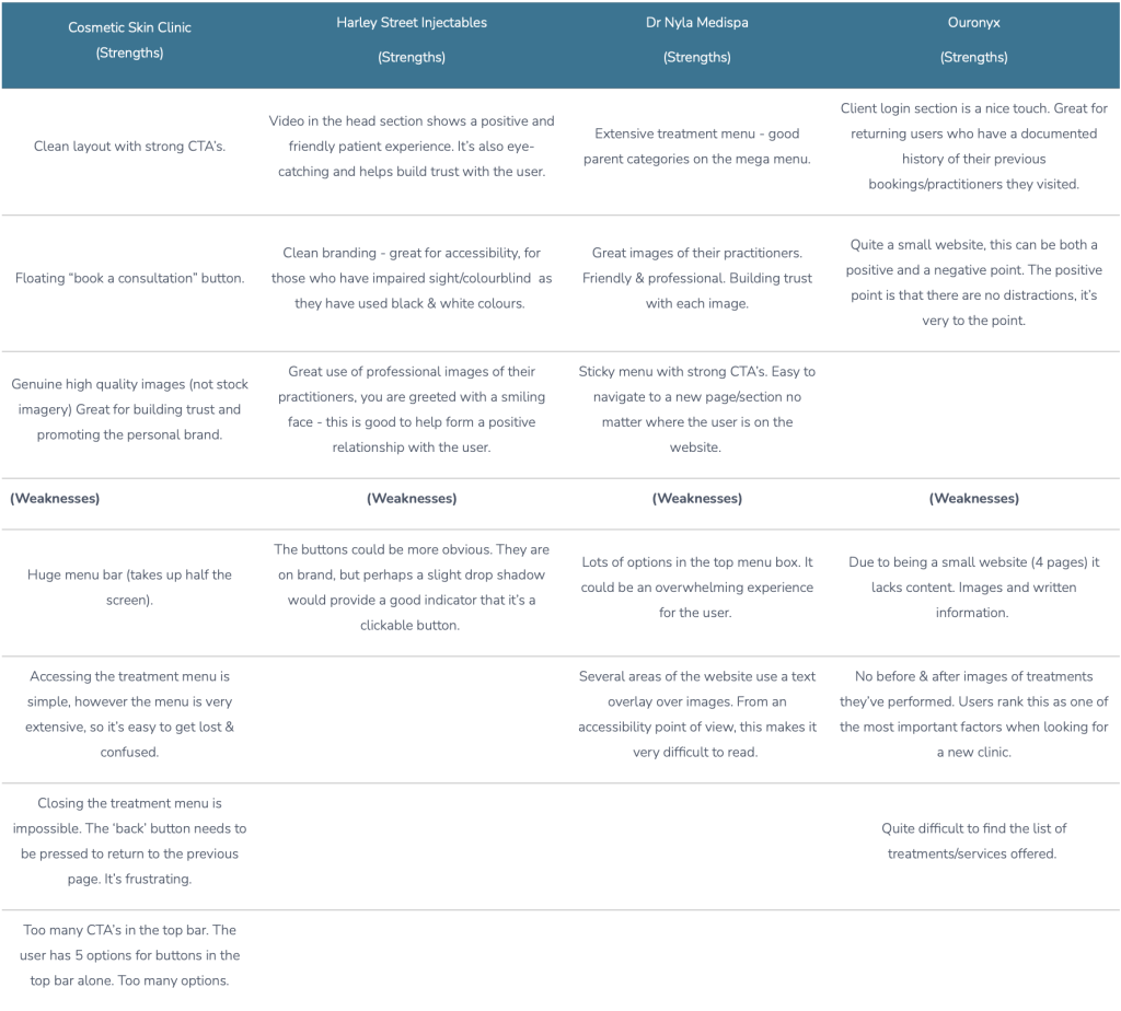
The client presented me with a list of clinic’s websites they liked the look of. The same list also happened to be their main competitors. This provided me with a good starting point for my competitor analysis. From utilising the list and my own research I was also able to research the users who interacted with the clinics competitors. I gained this insight by reviewing the social media activity for each clinic. This helped me establish a demographic that was typical with each clinic.
The competitor analysis also revealed strengths, weaknesses, MHRA compliance and the differences between other luxury clinics within a 15 mile radius. The distance was dictated by the client who said their patients usually travel up to 15 miles to visit their clinic.
In addition to researching the clinic’s competitors, I researched the luxury brand – Channel. The client specified that they wanted their brand, look and feel to be reminiscent of the brand Channel. They felt it was a good brand to draw inspiration from and that they wanted to be viewed as the “Channel of the Aesthetics world”.
Cosmetic Skin Clinic | Harley Street Injectables (Strengths) | Dr Nyla Medispa (Strengths) | Ouronyx (Strengths) |
Clean layout with strong CTA’s. | Video in the head section shows a positive and friendly patient experience. It’s also eye-catching and helps build trust with the user. | Extensive treatment menu - good parent categories on the mega menu. | Client login section is a nice touch. Great for returning users who have a documented history of their previous bookings/practitioners they visited. |
Floating “book a consultation” button. | Clean branding - great for accessibility, for those who have impaired sight/colourblind as they have used black & white colours. | Great images of their practitioners. Friendly & professional. Building trust with each image. | Quite a small website, this can be both a positive and a negative point. The positive point is that there are no distractions, it’s very to the point. |
Genuine high quality images (not stock imagery) Great for building trust and promoting the personal brand. | Great use of professional images of their practitioners, you are greeted with a smiling face - this is good to help form a positive relationship with the user. | Sticky menu with strong CTA’s. Easy to navigate to a new page/section no matter where the user is on the website. | |
(Weaknesses) | (Weaknesses) | (Weaknesses) | (Weaknesses) |
Huge menu bar (takes up half the screen). | The buttons could be more obvious. They are on brand, but perhaps a slight drop shadow would provide a good indicator that it’s a clickable button. | Lots of options in the top menu box. It could be an overwhelming experience for the user. | Due to being a small website (4 pages) it lacks content. Images and written information. |
Accessing the treatment menu is simple, however the menu is very extensive, so it’s easy to get lost & confused. | Several areas of the website use a text overlay over images. From an accessibility point of view, this makes it very difficult to read. | No before & after images of treatments they’ve performed. Users rank this as one of the most important factors when looking for a new clinic. | |
Closing the treatment menu is impossible. The ‘back’ button needs to be pressed to return to the previous page. It’s frustrating. | Quite difficult to find the list of treatments/services offered. | ||
Too many CTA’s in the top bar. The user has 5 options for buttons in the top bar alone. Too many options. |
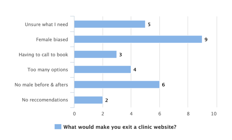
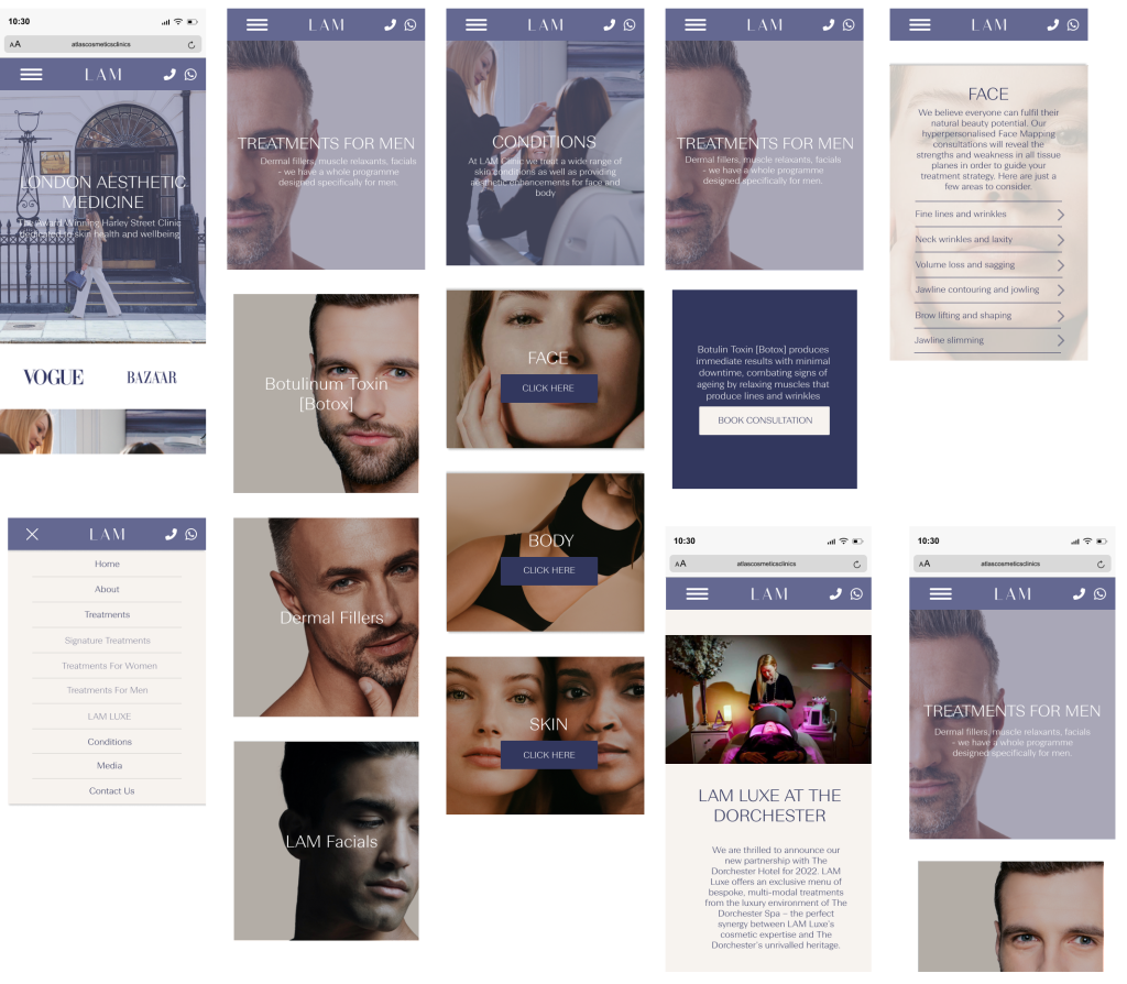
Of the clinics that were included in the competitor analysis I found that most used images of their practitioners, patients and premises. This is a great way to promote their brand, but mainly build trust with the users. LAM Clinic will need to have their own images of their own people too. Stock images don’t represent the user or the clinic.
The competitor analysis highlighted that most of the clinics have extensive treatment menus. They utilise mega menus and parent categories to make their menus clear and easy for the user to navigate.
Additionally, the mega menu doesn’t require too much real estate on the page.
Each clinic used social media and linked their website to their channels and vice versa. This is great for social proofing, again, building trust with the user.
Another common theme for the clinics is that they displayed their awards and accreditations, as well as their trust pilot and google reviews. LAM clinic will need to include these features on their website for credibility and to further build trust with the user.
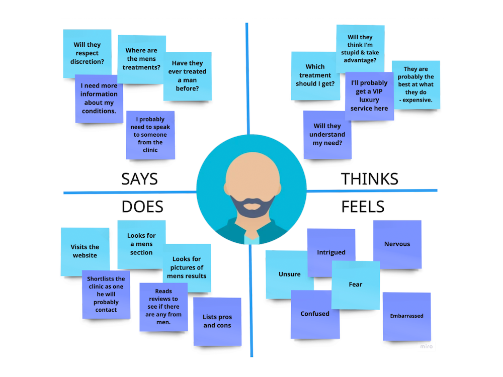
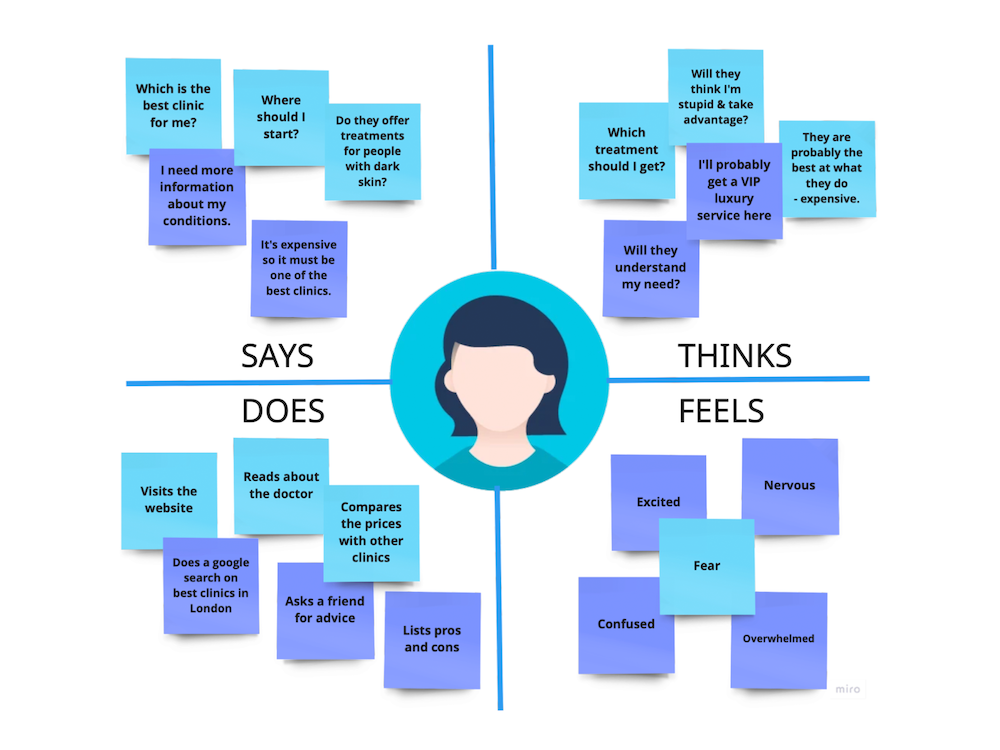
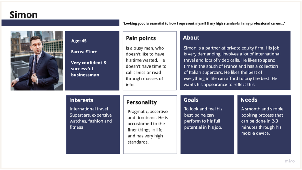
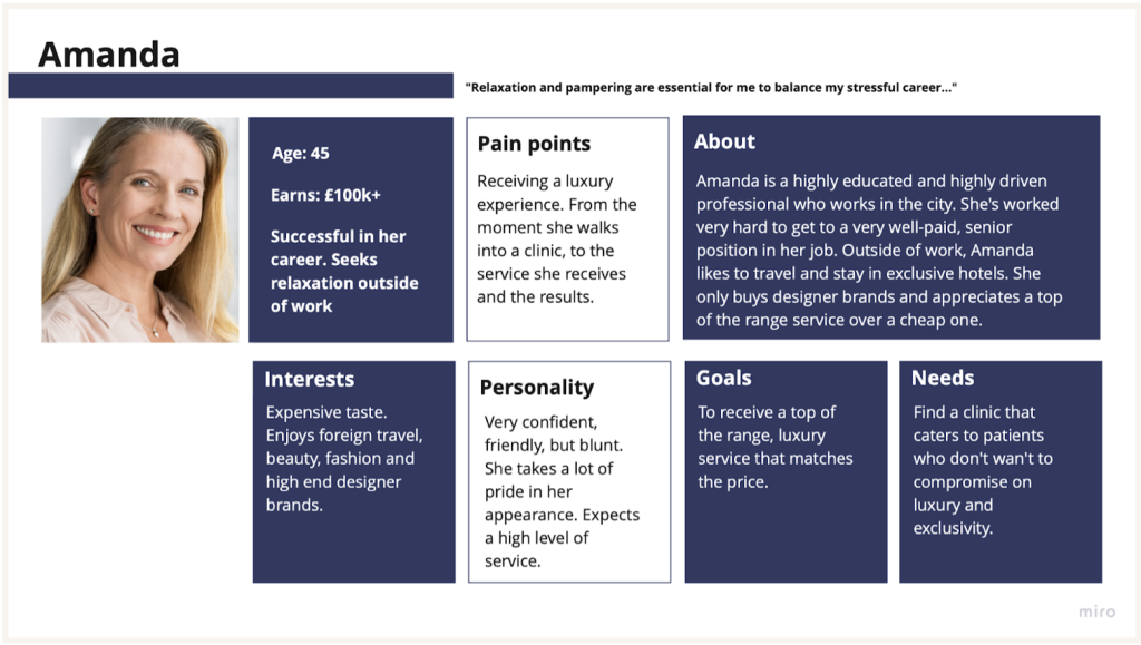
The personas were created from research and knowledge that the clinic already had from serving patients in their business for a number of years prior to this project. The client also had a desired demographic they wanted to target, this went into consideration when creating the personas.
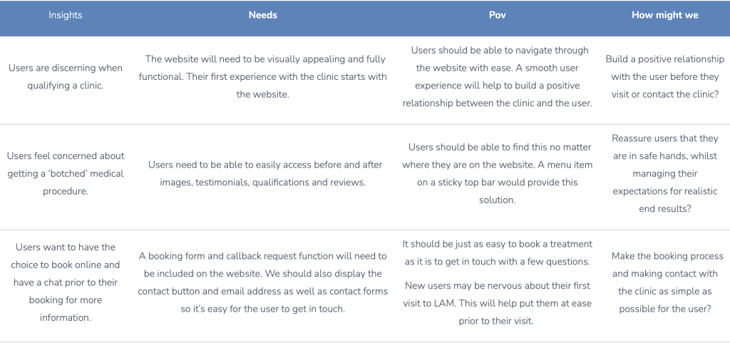
Insights | Needs | Pov | How might we |
Users are discerning when qualifying a clinic. | The website will need to be visually appealing and fully functional. Their first experience with the clinic starts with the website. | Users should be able to navigate through the website with ease. A smooth user experience will help to build a positive relationship between the clinic and the user. | Build a positive relationship with the user before they visit or contact the clinic? |
Users feel concerned about getting a ‘botched’ medical procedure. | Users need to be able to easily access before and after images, testimonials, qualifications and reviews. | Users should be able to find this no matter where they are on the website. A menu item on a sticky top bar would provide this solution. | Reassure users that they are in safe hands, whilst managing their expectations for realistic end results? |
Users want to have the choice to book online and have a chat prior to their booking for more information. | A booking form and callback request function will need to be included on the website. We should also display the contact button and email address as well as contact forms so it’s easy for the user to get in touch. | It should be just as easy to book a treatment as it is to get in touch with a few questions. New users may be nervous about their first visit to LAM. This will help put them at ease prior to their visit. | Make the booking process and making contact with the clinic as simple as possible for the user? |
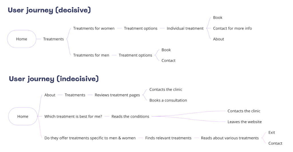
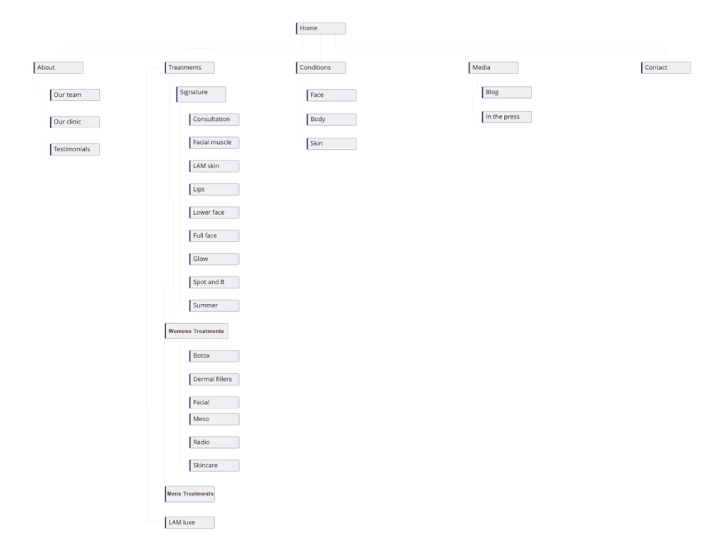
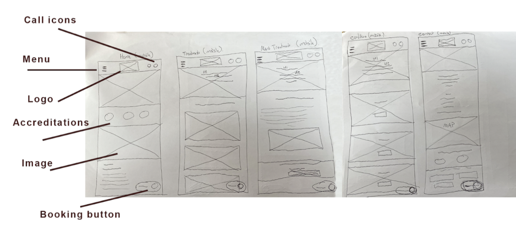
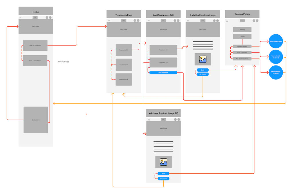
The design was started with the creation of a site map.
This was constructed by utilising competitor research, empathy and customer journey mapping and ‘how might we’ research.
The website needs to be easy to navigate and engaging for the user. If the site is simple and intuitive to navigate, it will contribute to a positive and engaging user experience. The product also needs to build trust with the user at every action.
The stakeholders were the first to test the prototype, this sample consisted of 3 directors and 5 industry leaders. They were accessing the prototype for the first time, so they reviewed it for its usability, functionality and how the brand was being represented through the website.
After this first test group, a few minor changes were made. Mainly increasing white space and reducing the size of some elements.
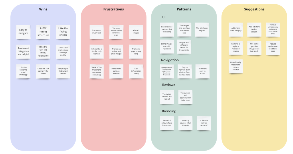
The next phase involved sending the prototype to 17 of the clinic’s existing users who they had a good relationship with. Each user received a discount off their next treatment as a thank you for participating.