

The following case study details the research, design methodology and prototypes of a solution that is designed to allow users to change the settings of their wireless security cameras from their IoT Device.
This work was carried out by researching similar apps in the marketplace, in addition to using the wireframes provided as a foundation to refine and simplify for a positive user experience.
My initial research took me to the app store to find similar products that are currently in the marketplace. I combined this with research that was conducted through search engines.
My goal was to establish if other products shared any commonalities with each other. Additionally, I wanted an insight into the look and feel of each interface. Did they use certain colours? What imagery do they tend to use? Who is their target demographic? How do they make the app inclusive for mixed users?
As the apps are used to edit security camera settings for cameras that will be protecting valuable assets and loved ones, it’s crucial to build trust with the user through a simple user experience. I kept this in mind to empathise with the user and judge the apps accordingly to find a good system that works.
AtHome (Strengths) | AtHome (Weaknesses) |
Allows cloud-based backups for the user. | There doesn’t seem to be a way to download the footage. |
Face recognition for friends/family. | No guides to configure the app, for less tech-savvy users. |
2-way audio, so the user can communicate with their pets. |
Alfred (Strengths) | Alfred (Weaknesses) |
Easy 3-minute setup. | Doesn’t allow the users to record in a higher resolution than 720p and the lowest they offer is 144p. |
Records with night vision, so the user can see footage that’s recorded day & night. | Displays ads for the premium version, which disrupts the user from their flow. |
Allows users to watch footage in live time. |
Warden Cam (Strengths) | Warden Cam (Weaknesses) |
Allows the user to remote zoom. | Although it offers a streaming service, the live stream is very slow. |
Allows the user to set regional motion detection by placing a grid over the image of the room. The user then draws the parameters with their finger. | They have a Q&A section for setting up devices. This could be much more engaging and interactive. |
Upon researching existing wireless security management apps in the marketplace, I was able to establish several trends.
All the apps I researched offered live streaming, cloud storage and multiple camera options. Each app did offer something unique, of the apps offered a great solution for setting up regional motion.
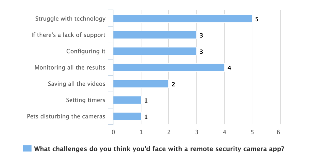
It’s easy to assume that all these apps are simple to use, and for most, they probably are. But how about the users who struggle with any form of technology?
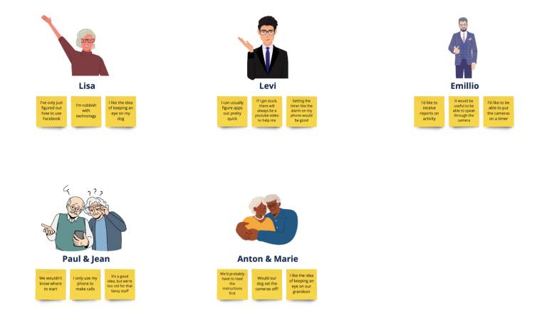
I had conversations with 7 participants. They were of mixed genders, ages and technical abilities.
When discussing the concept of a mobile app that could be used to configure security cameras and display live feeds and historic video footage, all agreed that it was a good idea. But certainly those in the age range of 35-82 said, “I’m terrible at technology, I wouldn’t know how to set something like that up” and “I’ve only just figured out how to use Facebook”.
I decided to design around their common pain points. Making it more user friendly for older, less “tech savvy” users, would improve their UX and the UX of other users.
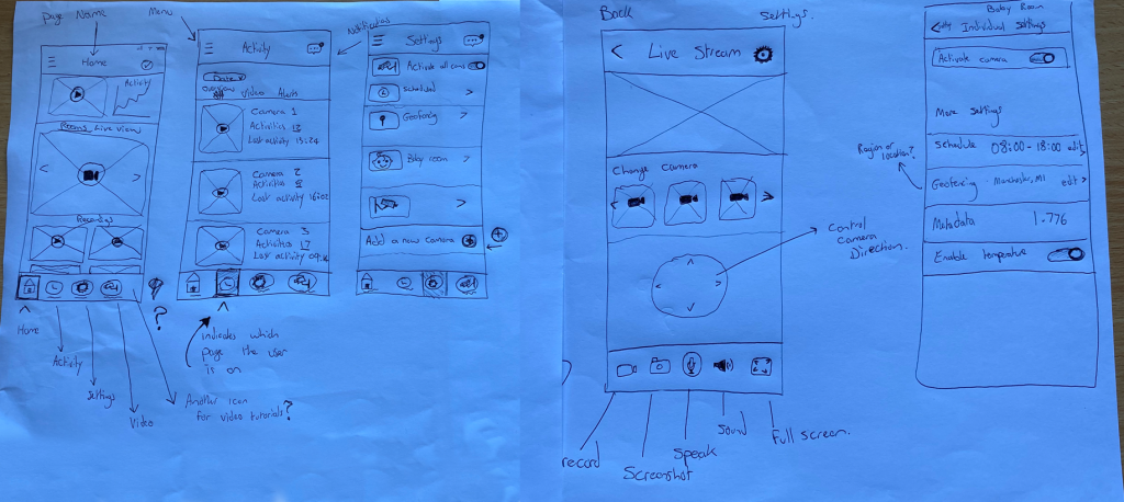
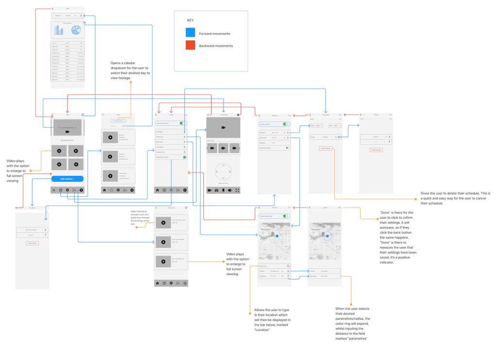
One example of this was to include a section that had short video tutorials on how to use the app. Whether the user needs to add a new camera, view their reports, or watch a live stream.
Taking into account the conversations I had with several users – my goal was to create a product that had accessibility at the heart of it.
My thinking was, if I made this as easy as possible for the users who claim to struggle with technology, then the users who are technically astute would also have an easier and smoother experience with the product.
A few ways in which I set out to achieve this were to create a video guide section. Many people learn visually and when it comes to using a new piece of software, or app, visual cues are key for the inexperienced user.
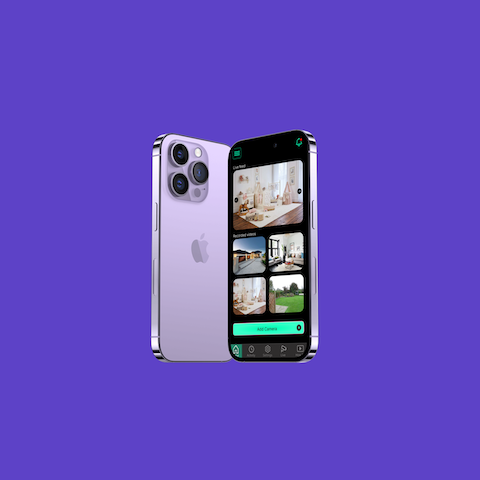
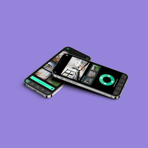
I chose to use black as the main colour for a number of reasons. The camera app on many smartphones is black, so users may already be used to interacting with an interface that looks similar, when accessing their camera. As this product is centred around cameras and surveillance, I thought this would be a great way to have a user build an affinity to a brand new product.
Another core reason for choosing black was to make the images and video footage stand out. If a user had neutral decor or white walls, the video might have blended in with the background and been harder to see. Especially for those who are visually impaired.
Finally, I wanted to have the “add a new camera” feature in an accessible location. I added a large button to the home screen and again added it as an option in the settings screen.
The app is clear from a visual perspective and creates a simple user experience. And for those users who may still struggle, there’s a video guide section to help them navigate their way through the product.